The Big Guide to Using a Tachometer in Power BI: Approved Strategies
Have you ever wondered how to use a tachometer in Power BI to enhance your data visualization strategies? If yes, then you are in for a treat! In today’s rapidly changing world, businesses and QA professionals are constantly searching for ways to present data efficiently and effectively. This is where a tachometer in Power BI comes into play. By visualizing data in this way, you can make quick, impactful decisions, and turn raw data into meaningful insights.

What is a Tachometer?
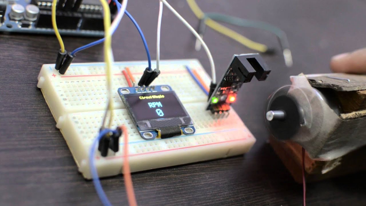
A tachometer is an instrument that measures the rotation speed of an object, typically represented in revolutions per minute (RPM). Though often used in mechanical contexts, in the world of data visualization, a tachometer can illustrate performance metrics, KPIs, and other data points in an easily digestible format. To know more about its general application, you can refer to this Wiki.
Why Use a Tachometer in Power BI?
The inclusion of a tachometer in Power BI simplifies complex data, making it more understandable. It allows users to see at a glance how specific metrics are performing, whether they are within expected ranges or need attention. This is crucial for industry QA professionals who rely heavily on precision and fast interpretations.
Benefits for QA Professionals
- Quick Analysis: Instantly see where key performance indicators (KPIs) stand. No need to sift through endless numbers.
- Enhanced Decision-Making: Make informed decisions quickly by getting the big picture in one glance.
- Efficient Communication: Share insights effortlessly with stakeholders who may not have a technical background.
Getting Started with Tachometers in Power BI
How do you incorporate a tachometer into your Power BI reports? Lets dive into the detailed steps.
Step 1: Install Power BI
If you havent already, make sure to download and install Power BI from the official Microsoft site. It’s free to start with, and setting it up is straightforward.
Step 2: Load Your Data
Power BI supports various data sources, including Excel, SQL Server, and cloud services. Choose your data source and import the required datasets.
Step 3: Adding a Tachometer
Go to the Visualizations pane and choose the tachometer visual. If its not available by default, you may need to import it from the Microsoft AppSource by clicking on Get more visuals.
Step 4: Configuring the Data
In this step, select the fields you want to display on the tachometer. Typically, youll need a measure for the value and possibly additional fields like target and range.
Step 5: Customization
Navigate to the format pane to customize your tachometer. You can change colors, labels, and other visual aspects to fit your presentation needs.
Best Practices for Using Tachometers
While creating tachometers in Power BI is relatively straightforward, a few best practices can ensure you get the most out of this feature.
Use Consistent Units
Ensure that all data represented on the tachometer uses consistent units. This prevents confusion and makes your data more trustworthy.
Clear Labeling
Always use labels and legends to make sure everyone can understand what the tachometer is showing.
Applying Tachometers in Real-world Scenarios
Monitoring Production Lines
If you are involved in manufacturing or quality assurance, a tachometer can be used to monitor production lines, ensuring that they are operating at optimal speeds. For instance, check out this case study on semiconductor manufacturing for inspiration.
Quality Control
Maintain product quality by closely monitoring key performance indicators with tachometers. Refer to real-world examples in paint application inspections.
Advanced Features
Power BI offers advanced features that allow you to further enhance your tachometer readings.
Conditional Formatting
Conditional formatting can change the appearance of the tachometer based on predefined thresholds. This feature can alert you to areas that need immediate action.
Tooltips
Add tooltips to provide additional information when users hover over the tachometer.
Common Challenges and How to Overcome Them
Every tool has its challenges, and tachometers are no exception. Here are some common issues you might face and how to address them.
Data Inconsistencies
Inconsistent data can lead to inaccurate tachometer readings. Always clean and standardize your data before visualizing it.
Too Much Information
A tachometer is designed for simplicity. Avoid overcrowding it with too much data or too many ranges. Stick to the key metrics that matter most to your audience.
Future Trends
Incorporating AI and machine learning will likely enhance the capability of tachometers in Power BI, allowing for more predictive analytics and smarter decision-making.
Conclusion
Understanding how to use a tachometer in Power BI can significantly benefit any organization. From quick decision-making to superior data insights, tachometers offer a simple yet powerful way to visualize performance metrics. As QA professionals, the ability to display and interpret data clearly and accurately can make a tremendous difference in your daily operations. For more advanced applications in semiconductor wafer polishing inspection, refer to this in-depth guide.

FAQ
What types of data are best suited for a tachometer in Power BI?
Performance metrics, KPIs, and any other data that can benefit from visual speed indicators are best suited for tachometers.
Do I need any special skills to use a tachometer in Power BI?
No, basic knowledge of Power BI and an understanding of your data are sufficient to create and use a tachometer.
Can I use tachometers for real-time monitoring?
Yes, if your data sources support real-time updates, tachometers in Power BI can display real-time information.
